Colours have the power to transform a space, while also influencing our moods and thoughts. Going monochrome, or using only one colour, definitely intensifies the overall look and feel, while also being timeless and stunningly elegant. Be inspired by the below monochrome looks and discover what each colour evokes.
Although often misinterpreted as black-and-white, ‘monochrome’ is a composition of mono (= single) and chromatic (= colour), so using a single colour. Yet it doesn’t mean that you have to stick to one solid colour. In fact, it’s best to play around with different tones and shades of the same hue, as well as different textures. This prevents the design from being either too overwhelming or too monotone.
Colour psychology at work
The psychological impact that colours have on us is especially interesting when applied to offices or other commercial spaces. Certain colours can help to improve focus and concentration, while others have a negative impact on productivity and performance. Using a monochrome colour palette can enhance the subconscious effect.
Creating monochromatic settings
With its colour-coordinated &-collection, modulyss brings 3 carpet tile ranges that can be mixed and matched to create bold monochromatic settings. The watercolour-esque pattern of Fluid& can be combined with the subtle linear texture of Fashion& and the vintage velvet look of Velvet&. And, good news, the collection is ever-expanding! Each year a new design is added, offering new variations in pattern, texture and colour.
01 | Majestic blue
This deep blue shade is intense and awe-inspiring. It reflects the calmness and serenity of a deep pool of water or a vivid blue sky. Although blue can also be associated with sadness (e.g. blue Monday), it’s ideal for workplace areas because of its calming effect. Furthermore, blue is believed to lower blood pressure, while boosting productivity and overall wellbeing.
Credits top right image | credits bottom left image | other ©modulyss
02 | Luscious green
In line with biophilic designs that try to reconnect us to nature, the colour green also evokes peacefulness and balance. When applied to an office setting, green surroundings can relieve stress as well as improve eyesight. This warm green shade is especially soothing and lush.
Credits top right image | credits bottom left image | other ©modulyss
03 | Lavish rust
Being a mix of orange, red and brown; this on-trend rust shade is complex and can be associated with the warm tones of a sunset or an autumnal day. It can boost energy, while also bringing comfort and warmth. Furthermore, it’s believed to stimulate an appetite and encourage conversation, making this burnt orange shade the ideal choice for kitchens or lunch areas.
Credits top left image | other ©modulyss
04 | Spicy yellow
Did someone say teamwork? Then this spicy yellow is right up your alley. Thanks to its brightness it stimulates optimism and energy. In addition, yellow has a positive effect on your self-esteem and creativity. This makes it a great colour choice for brainstorm or other creative areas.
Credits top left image | credits top right image | other ©modulyss
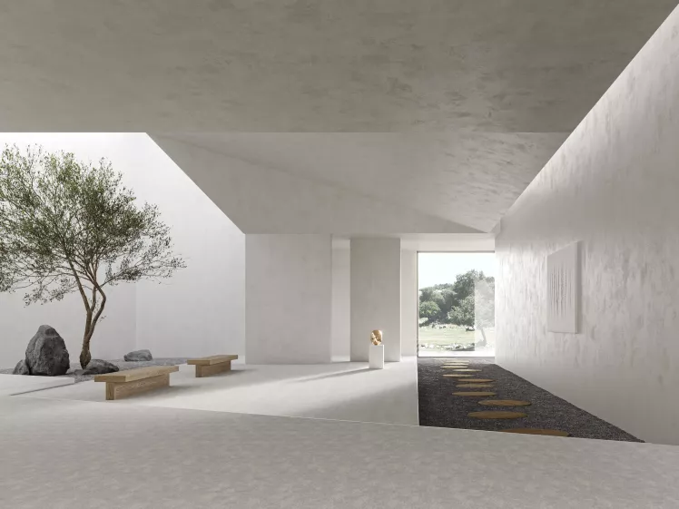
05 | Mysterious grey
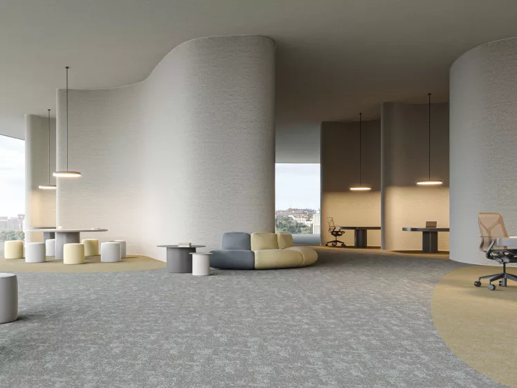
Balancing out black and white, grey represents neutrality and reliability. Although this can be seen as a safe choice, it’s actually quite challenging to create an interesting space using only greyscales. Too much can tip the scale from being elegant and balanced to being heartless and soulless. Nevertheless, grey would work well in industrial buildings that combine different textures, or in offices or reception areas if you’re going for a sophisticated minimal look.
credits bottom left image | other ©modulyss
Which monochrome should I pick for my office?
Depending on the function of your space, it can be interesting to pick any of the mentioned colours.
For your desk area, blue or green monochrome colour schemes would work best because both colours create a sense of calm and wellbeing. While blue also has the tendency to boost productivity, green mainly reduces anxiety and eye strain. This quality also makes green suitable for quiet zones and relaxation areas.
Meeting and brainstorm rooms require a more expressive colour. Yellow stimulates optimism and energy, ideal to get those creative juices flowing.
Another energizing colour is rust. Thanks to its aura of comfort and warmth, which also encourages conversation and creates an appetite, it’s a good choice for lunch and break areas.
When you’re going for a minimal and reliable look and feel, grey is the better choice. Think a classy executive office or reception area.

Get a feel for our carpets.

Get news and insights

modulyss Now Available on Material Bank

Design Innovation: modulyss at Archiproducts' Aqua Event curated by Studiopepe

Oktra’s Custom Carpet Design Journey


